I think this is a great start, and here are a few ideas from me:
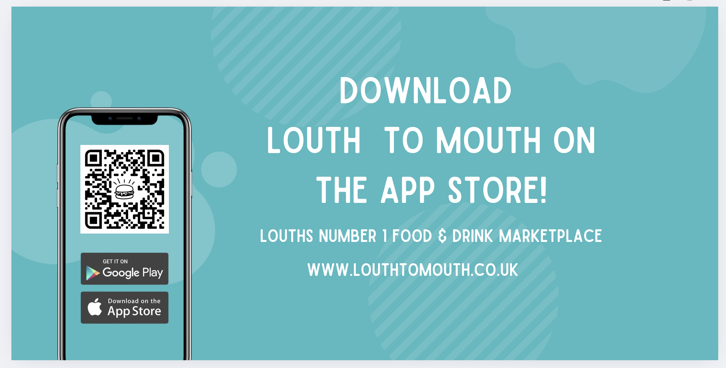
The mobile image is good, but you could take the opportunity to show some food on this billboard by using an app screenshot here, either of a menu item with a good image, or an outlet list with some great segment images. I would choose a food image that contrasts well with the blue background to bring some extra colour here, and something that lets people know it’s a takeaway app, for example, pizza.
You can move the app store icons into the main area of text, out of the phone frame, and near the url, so you are grouping together your call to actions.
You could experiment with the alignment of your text, centre-aligned text isn’t the most readable. Also sentence case or title case is more readable than all caps.
I don’t mind a QR code, but they are not necessary if you need to save space, as you have a full URL on your billboard.
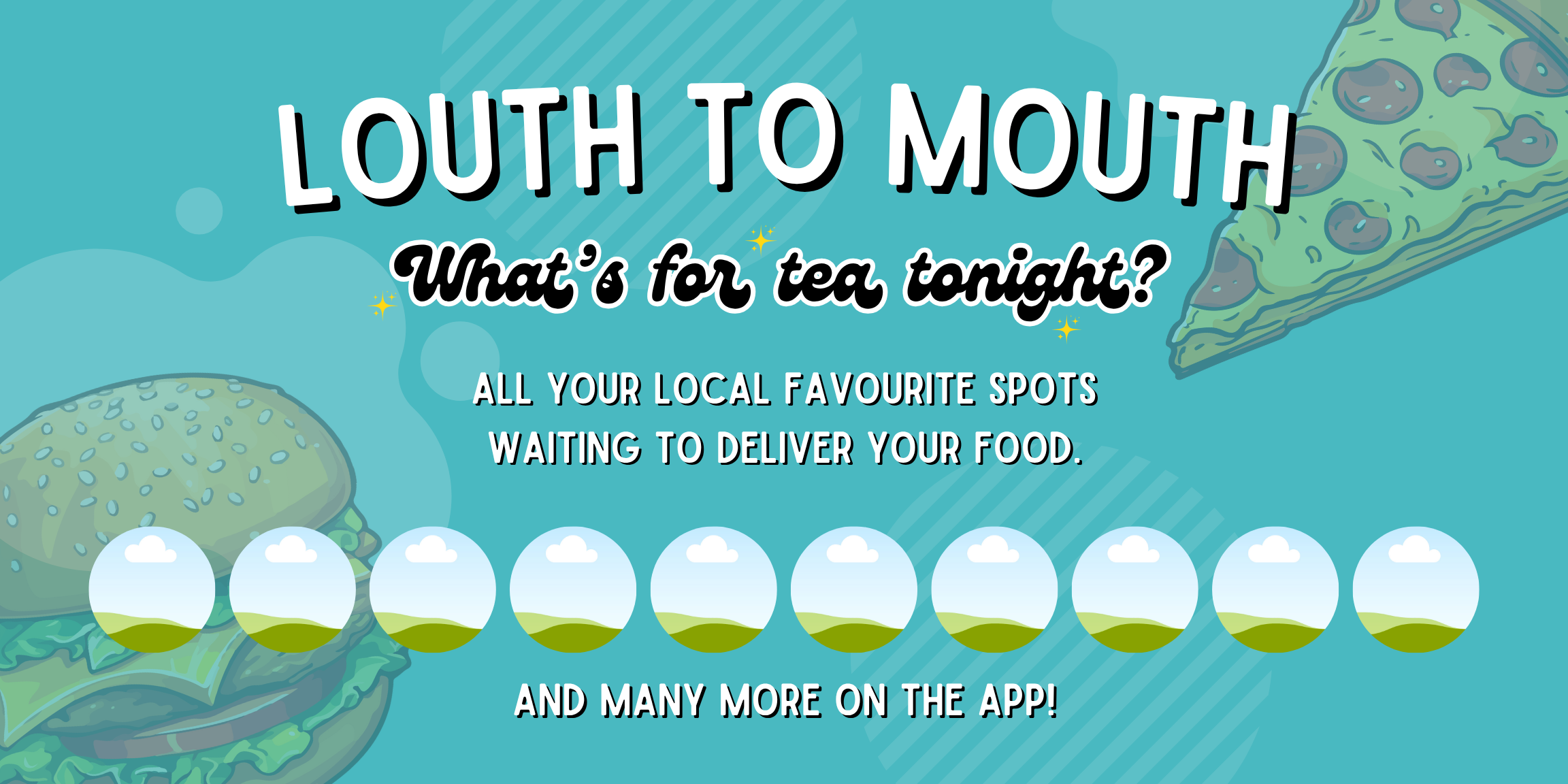
Consider some other features of your marketplace that could draw customers in, for example, exclusive restaurants and discounts, or the opportunity to support local.